We all know that poor design negatively affects user experience and sales results. We also know that different devices don’t share the same capabilities and have their own limitations. Each of the limitations influences the app creation process and has to be taken care of respectively. That’s why, designing a smartwatch app, a designer has a slightly different approach than he has while working on a mobile version.
Purpose of the invention
It is said that you can replicate about 60% of app functionality on a smartphone and then 20% on a smartwatch. It’s because mobile phones allow for more interactions than a smartwatch. Smartphones have bigger screens, displaying everything clearly and provide a lot more functions to a user (i.e. watching movies). Also, they are better adapted to phone calls. As a wearable device, a smartwatch is of course smaller. It was invented mainly as a gadget that would be more comfortable and less disturbing than the phone. And even though today, you can make phone calls and send messages on a smartwatch, the app responsible for that had to be designed specifically for that device to be able to provide users with satisfaction.
Differences that influence the design process
- The screen surface is decreased which makes the interface planning more complex
- Smartwatches vary in shapes (round vs square-faced smartwatches)
- User behavior is different (limited screen surface)
- A smartwatch is a highly personalized device, so an app must be a really useful tool
- The device has smaller memory storage and is less efficient
- Such an app has to be energy efficient because of the lower energy capacities and user expectations to run at least all-day
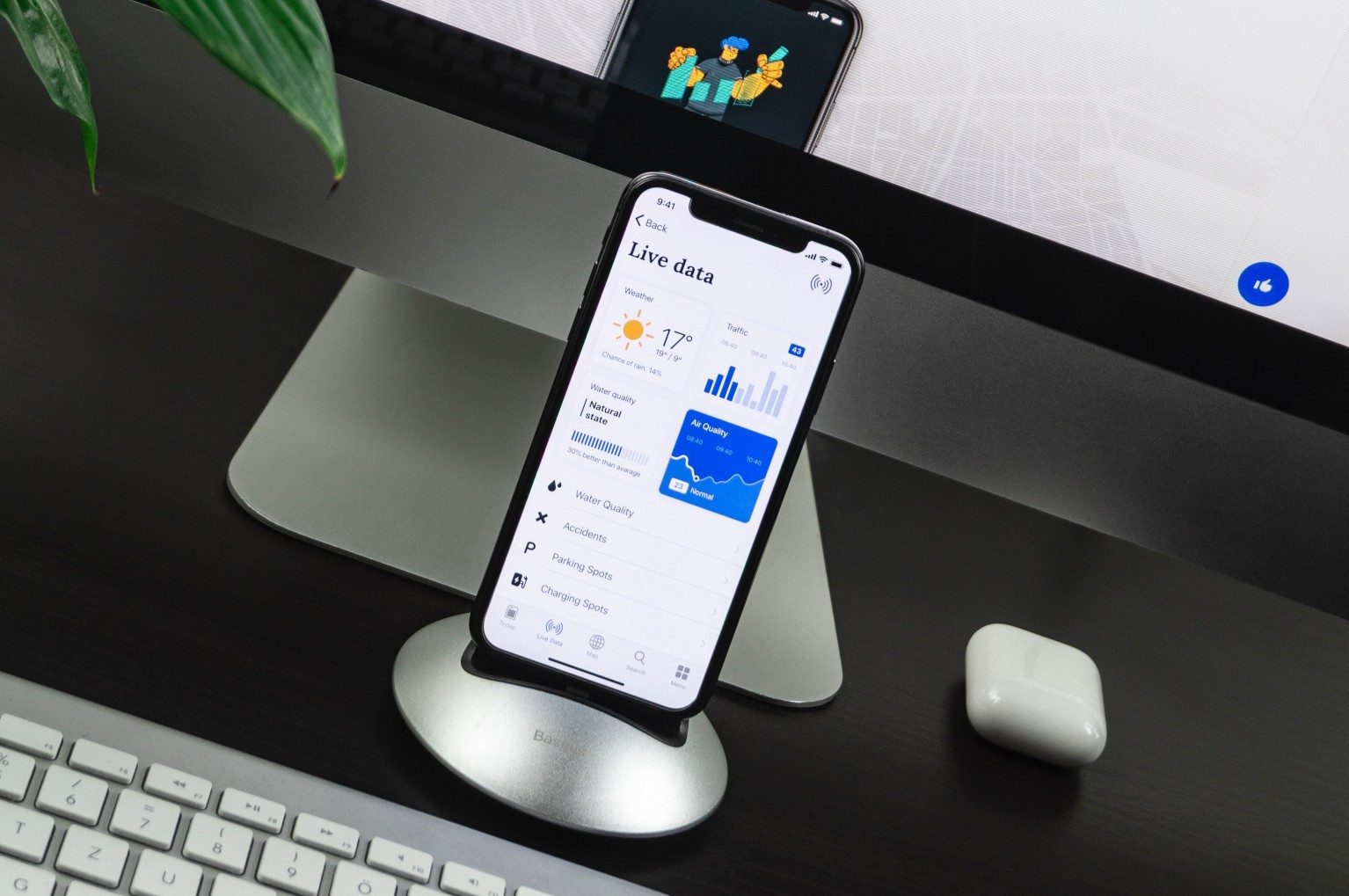
The biggest limitation is the size screen
Designing an app for a smartphone we already have to limit ourselves, however, today the mobile phones reach the size screen of over 6 inches. It is quite a lot of space to accommodate the functionalities in a convenient and intuitive way. The biggest screen size of a smartwatch is 2.4 inches – Neptune Pine. When we take a standard Apple Watch Series 5 we have an only 1.78-inch display. Since the screen is smaller the buttons in an app should be more visible but then you can’t have too many of them as they will cover up the whole screen. That’s why the app functionalities are limited to only a few that are most needed. It is made also as to not complicate the app. Its nature should be quick, useful and informative.
Intuitive functionality
Different interactions of a smartwatch app should be alerted in different ways. Physical vibrations are for one type of interaction and screen glow for another. This way a user can easily define the importance of information. Also, users have to be able to read whatever pops up on the screen from different angles while moving. That’s why you should ask yourself a couple of simple questions:
- What are the users going to be doing while using the app?
- Where will they be? (the gym, shop, work, house)
- What happens with the app when the users change their location?
To meet all the expectations
Designing a smartwatch app a designer has to think about the convenience of use twice as much as he does while working on a mobile version. This kind of project is very demanding because having relatively small resources, a small amount of energy and usage restrictions, you need to provide the users with high-quality functionalities. At the same time, you need to make them remember that it was this app, they were using. To meet user expectations, we consider all the problems while creating user stories. We write them to predict different behaviors of people using the app. This way we can come to the conclusion that the ability to turn off notifications and buzzing is a valuable feature that must be added.
How to compensate for the limitations
Smartwatches are not as powerful as mobile phones. Memory storage cannot be filled up, too many wireless connections are also undesirable for the processor. The device can quickly heat up and we don’t want that as it is close to our wrists. The battery is smaller so it discharges quicker. However, there are features that outperform typical smartphones and can be implemented to improve the overall usage:
- super-quick load time
- health-related sensors (motion sensors and GPS) tracking the person’s activity
- device optimization sensors controlling the settings panel (light intensity, overheating)
- voice sensors to use Google Assistant and Siri
- compatible with Android and iOS devices to create direct communication with a smartphone (via Bluetooth pairing)
It’s a smartwatch so be smart when designing it
If an app isn’t designed specifically for a given device, chances are you won’t be using it. It’s not only the matter of an aesthetic interface but the functionality and UX that have to be tailored to a given construction. The decreased surface is challenging but today’s smartwatches show it is possible to modify the functions so they suit the device and provide excellent life assistance.