The main purpose of creating a landing page is to reach conversion goals. It is everything from purchasing a product to requesting information on your page. The website should identify your company, making it outstanding among thousands of similar ones. Your landing page is also the basis for further marketing activities, those performed on social media or paid advertisements on YouTube, and other browsers. If it’s so important then you should definitely know how to design a landing page.
Start with the plan
To design your landing page first you have to describe the needs and define your company. What kind of conversion goals do you want to achieve? Customers making a purchase (Patreon, Hbloom), register on your website (Bench, Tumblr), getting more information or something else? Remember that each landing page should be focused on only one conversion goal. Otherwise, you split the attention of the customers ending up with poor results. After covering the above questions you are ready to learn more.
What is the conversion rate?
It’s the percentage of people who visited your website and completed the desired goal (made a purchase, register to free trial, etc.) out of the total number of your visitors. How do I know if the conversion rate obtained is good? According to WordStream, an average conversion rate in AdWords across all industries is 2,7% on the search network while only 0,89% on the display network. It means that if you obtain 5% you’re pretty awesome, however, some of the best landing pages reach the conversion of 10% and more. In general, the only thing that matters is if your ratings are better than your direct competitor’s.
Somemust be includedelements
Any landing page includes four parts: the headline, the sub-header, the must-know information, and the additional information. Among those, the most important element is a call to action (CTA). Most often it stands out in the form of a button, link or form. The main purpose of this element is to make people take action, for instance, making a purchase. As you can see, the call to action is crucial as when placed somewhere between paragraphs it reminds people to respond somehow to the given information. Knowing that, consider the design of the button as well as the content of the section in which the CTA will be placed.
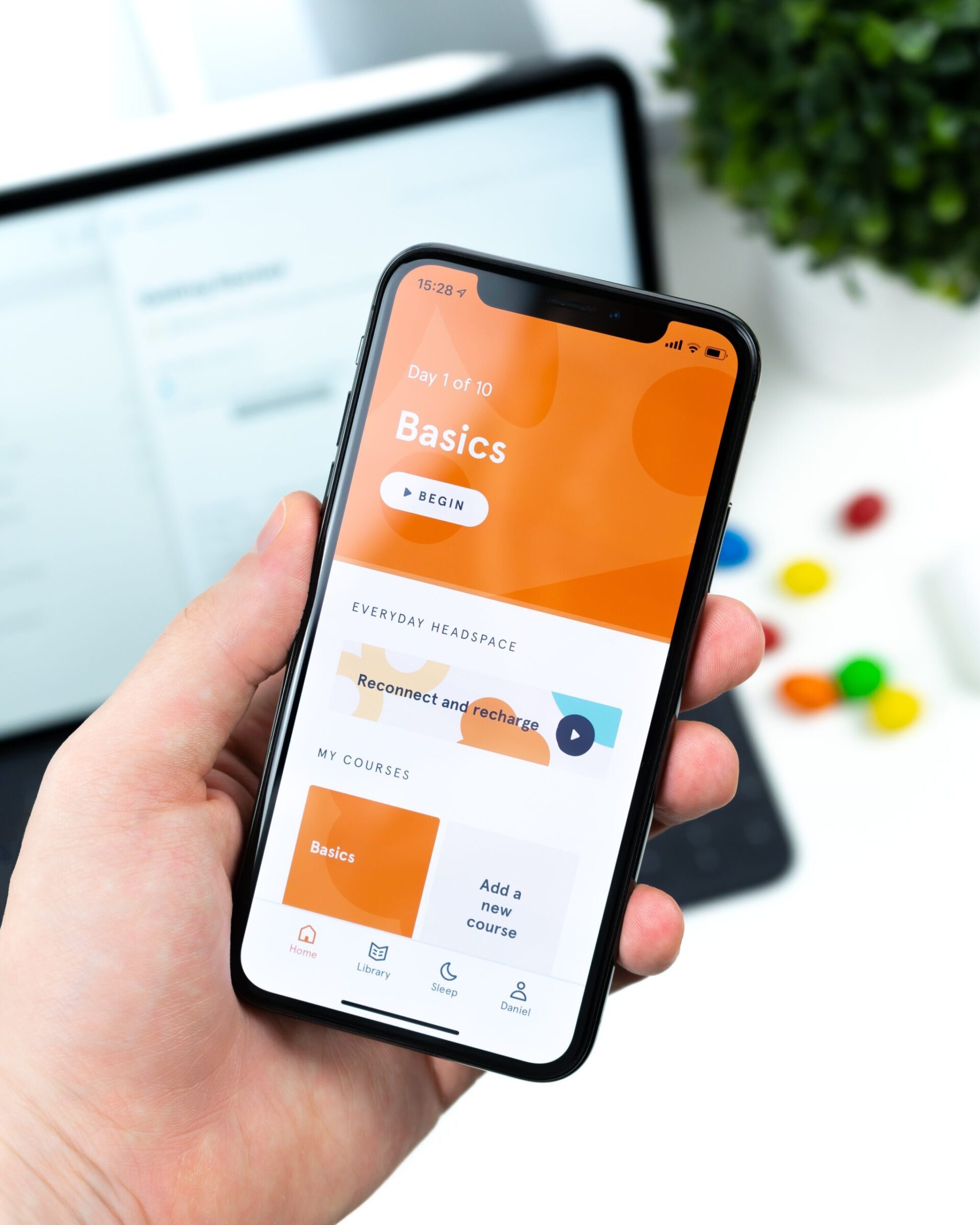
Inserting images
I hope it’s obvious that when your product is an app, the screenshots of the app should be provided so that the customer sees how it looks like. The same when your product is a physical object. Photos of what people actually buy are important to gain their trust and reinforce your message. If you have a choice, use original images. Stock photos even though are the cheaper option can be used by any of your competitors.
Adding videos
When it comes to high-quality videos, they are a good option for those not interested in reading a ton of text. Videos make people spend more time on your page and considering more complex products, a video can be a great explanation of what the product is. Snapchat is a good example of a landing page where the visuals in the background and throughout the page are informative and useful to the users. Not to mention the fact that a good video can greatly increase your conversions. Just don’t set the autoplay as soon as someone lands on your landing page cause in most cases people find it really annoying.
What else can be included?
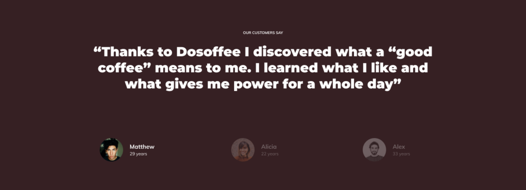
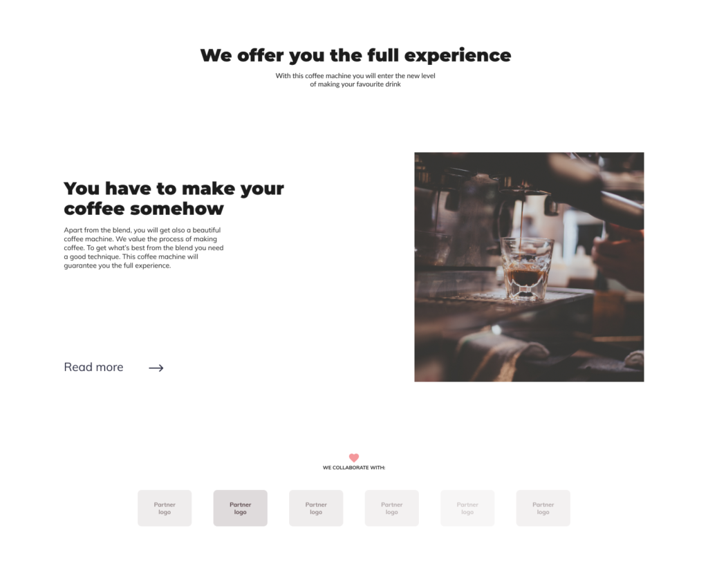
A good option is to include information about the number of current users or companies that trusted your services. Social proof is something valuable as people believe that something is good by looking at the number of people that use it. In other words, testimonials on your landing page can be very persuasive and work on people who are undecided. The same with the logo of brands that you collaborated with. A good validation is also to display the number of followers from Facebook, Twitter or other platforms. Any statistics that would portray your product as a reliable one will serve your conversion.
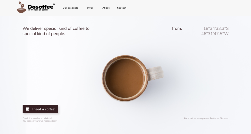
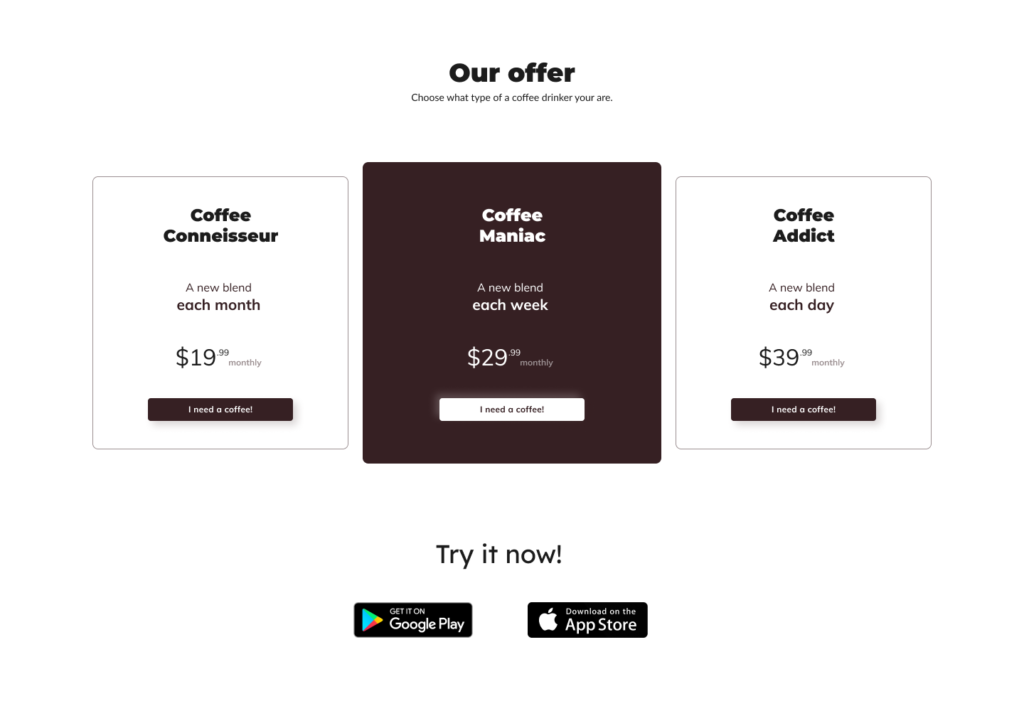
Coffee subscription program example
Below we present an example of a well-designed landing page that is made to sell a coffee machine with a subscription program for coffee packages. By the way, read Subscription vs purchase business model – to know which model better suits your product.
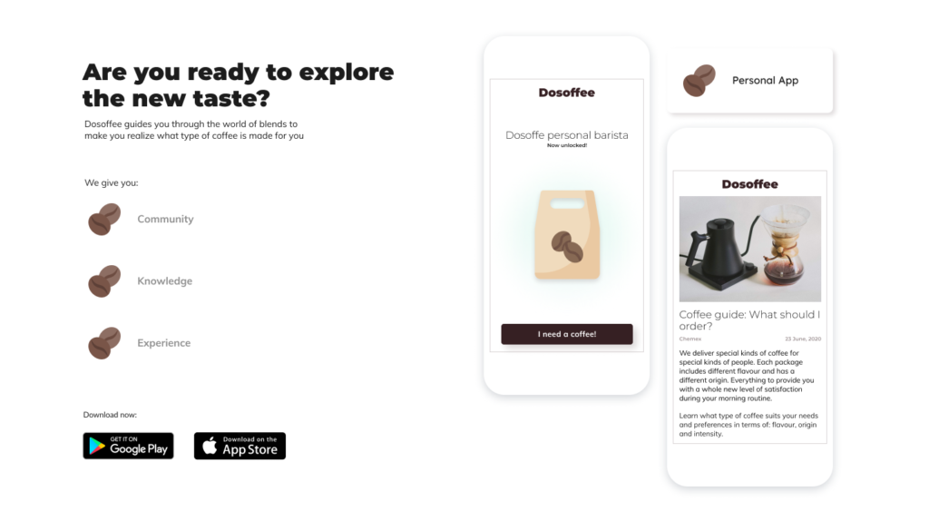
The landing page is consistent in style and color. The front section includes the call to action button – I need a coffee. The CTA button is also placed below in the payment options section. As you can see there is an image of the product itself as we captured some screenshots of our coffee app. We also added social proof in the form of “partner” panel and customers’ reviews. There is a read more that directs a customer to a site with more information about the coffee machine. We provided three subscription options to make the choice more convenient.
Leverage analytics tool
Very often the conversion rate depends on a small change introduced to your design. A proof to that can be the Button Color A/B test performed to see if the color of the CTA button decides about the conversion rate. It turned out that when making two exactly the same landing pages (except one with a green button and one with a red one), the red button outperformed the green one by 21%. To be able to run such A/B tests and see which configuration works best you should use a proper analytic tool that would measure the conversion of your landing page and inform you about the progress.
To monitor parameters like time spent on your page and the total actions taken you can use Google Analytics, Hotjar or Yandex. A good tool is also Crazyegg which will help you understand why customers leave your landing page and Pingdom which serves as a speed test to show you how long does it take for your website to load.
To design a landing page
that converts is not always easy as many factors have to be tested out before deciding which one generates the best results. Also, the marketing trends change and you have to keep up with them to know what can be done better in your project. Remember that each change brings you closer to the conversion goal as long as you pay attention to the analytics.
Cookies help us deliver our services and improve your experience. We use them to analyze our traffic and customize content and ads. By using our services, you agree to our use of cookies. You can turn cookies off by changing your browser settings. Read our Privacy policy.
Functional
Always active
The technical storage or access is strictly necessary for the legitimate purpose of enabling the use of a specific service explicitly requested by the subscriber or user, or for the sole purpose of carrying out the transmission of a communication over an electronic communications network.
Preferences
The technical storage or access is necessary for the legitimate purpose of storing preferences that are not requested by the subscriber or user.
Statistics
The technical storage or access that is used exclusively for statistical purposes.The technical storage or access that is used exclusively for anonymous statistical purposes. Without a subpoena, voluntary compliance on the part of your Internet Service Provider, or additional records from a third party, information stored or retrieved for this purpose alone cannot usually be used to identify you.
Marketing
The technical storage or access is required to create user profiles to send advertising, or to track the user on a website or across several websites for similar marketing purposes.