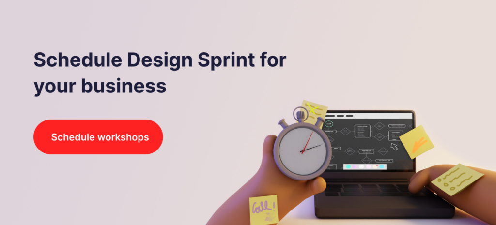
The design sprint is a five-day workshop focused on validating design hypotheses and answering critical business questions. Through rapid prototyping and testing processes, participants work out the direction of their product and business model. When performed right, it saves companies a lot of time spent on ineffective brainstorming and resources invested in untested features. However, if you want to get a valuable outcome first, you need to know how to run such workshops.
The product design framework (PDS) is applied for many different reasons. Teams use it to kick-off their projects, to speed up the development, or to leverage new data or research. The idea behind the framework is to use prototyping, user research, and testing to solve complex problems. The process is flexible enough to be adopted in a way that serves your own purpose. Now let’s move on to the value it brings.
Starting off with such an intense and focused workshop gives you a huge advantage. After it’s done, you no longer guess the aim or the necessary features of your product – you are perfectly sure what you need.
Investing money into untested ideas is the shortest way to a failure. Companies often risk their resources having nothing to support their motives. Design sprint represents the opposite approach. It reduces the risk by forcing companies to base their actions on reliable data.
The process shortcuts months of debating on features and development. By challenging product design and strategy with the use of real users, you can quickly validate your ideas and save both time and money.
Design sprint lets you set up a development path for your project by exploring possible directions. In just 5 days you get to work out the plan to follow for the next months.
The workshop requires the collaboration of a cross-functional team. It gathers members of different disciplines in one place to focus on one goal. The result is effective, boiling teamwork that leads to valuable conclusions.
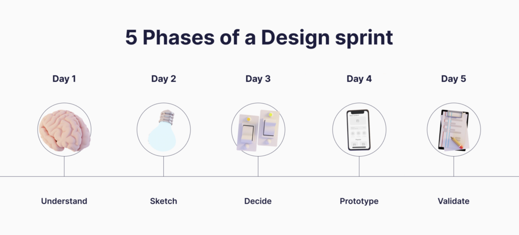
Design sprint follows five phases:
Everyone should be on the same page. That is why the first stage is about sharing prior technical and user knowledge about the product and discussing business goals. After reviewing the background and all the user insights, the team creates a user journey and tries to map out the pain points. Then there’s a discussion on how might we solve the issues and improve the current process.
The next phase is about brainstorming and defining the desired outcomes and possible solutions. Everyone individually tries to come up with multiple sketches of the solution which are then presented to the group. Then, the team works together to narrow down the ideas to one sketch per person. If the workshops are held online, the group work can be transferred to a tool like Figma. A popular exercise is also Crazy 8’s where each person needs to sketch 8 different ideas in 8 minutes.
Now is the time for voting and choosing the final direction. Everyone gets approx. three minutes to present their solution while other people may ask questions or write down their thoughts. Very often people have different opinions about the presented work. That’s why it’s good to hang all the sketches on the wall and let one person sum up the core approach of each idea. Silent voting is also helpful in optimizing the time needed to choose the Sprint focus.
At this stage, the sprint team works together to create a prototype which is, in fact, a minimum viable concept that can be validated later. This type of prototype shouldn’t take much time, it has to include only enough details to attract potential users and gain feedback. The group chooses which steps in the user flow should be tested as a priority and starts the process of prototyping.
Finally, the user research! The concept is presented to real users who now can interact with the prototype and provide the group with feedback on the solution. This is the most valuable stage where the sprint hypothesis is either accepted or rejected by the target group. The users usually point out things worth the improvement which in turn leads to working out a better UX.
They say planning the workshop is even more important than performing it. Take that seriously and organize days so that each ends up with valuable insights and summaries.
The brief should include a list of defined goals, deliverables, agenda, and a description of the way people will work on the solution (group exercises and tools used). The document should also provide the sprint team with background for the project and any data that are already collected.
It’s good to have a team of five to eight people (depending on the aim and complexity of the project). An ideal project team includes:
Creating visuals means gathering all the inspiration sources, screenshots, data, and research summaries in one place so that the sprint team can always refer to them when working on a solution. Sharing data insight will also help the people create something useful and reliable based on the information provided.
It’s good to perform user research upfront to provide the group with information on how people are currently using the product. The data can be presented at the Understand phase to help kick off the process and provide team members with knowledge on things worth the improvement.
Warm up the crowd before starting the actual design sprint. It stimulates creative thinking and strengthens the relationship between team members right at the beginning of workshops.
When things happen online, there are multiple helpful tools to visualize the work for the whole team such as Miro.io or Figma. It’s also good to have a tool where the progress in the sprint can be monitored such as Hive or JIRA.
The design sprint is hard work. Such an intense effort deserves to be rewarded! End the process with a little celebration so that the participants can enjoy the moment before another week of developing the product.
If you wish to take part in a process designed specifically for the purpose of your growth – contact our team and let’s kick off your idea!
The user experience, or UI, is one of the most important aspects of any app, and it can make or break a business. While it’s not the same as the user interface (UI), the UX design directly affects the UI design, and therefore the entire look as well as the feel of the app. Just like fashion or tech toys, UX design is not immune to new trends and fads which excite users and make them want to own the app. As a software development company, we here at Redvike need to have an understanding of changing user preferences and keep up with all the latest technological developments. Based on that experience, we will present a list of UX design trends which we believe will prevail in 2022.
Let’s preface this by asserting that user testing is essential! Designers know this, and it’s vital to understand – you shouldn’t base the UX on your own preferences. Instead, read the room, so to speak. Really hear your users and deliver what they actually want and like. Their opinions won’t always come directly and clearly. That’s why it’s also important to analyze behaviour and interaction with the app.
Let’s take a look at the most popular features predicted to dominate apps in 2022!
The use of 3D elements is not unfamiliar, yet their designs have been excelling over the years and we don’t see it stopping any time soon. They can be used to create a modernistic look like with the new macOS; or to display products to give a realistic feel to them, which in turn drives increase in sales. Even when using a minimalistic approach to a website design, 3D elements can give it a proper oomph factor without being overbearing. The issue so far has been that complex 3D elements take ages to load, which is obviously a disincentive for users to stay on a site or app. Developers are already working on this problem, so we foresee drastic improvements in loading times and element quality.
Users are enchanted with animations because they tell a story, and they can show someone what to do without actually using text to do it. Interactive animations actually have usability and purpose besides being merely eye-catching and entertaining, and they will continue to be heavily used in 2022. A separate subgroup of animations that will remain a UX trend are so-called micro-interactions – smaller animated elements which engage users and add imperceptible appeal to the app or website. Some examples of micro-interactions are: animated loading or refresh pages, Facebook reactions, email swipe actions, internet speed tests, and many more.
While this is not new, dark themes are still a lacking feature in many apps. This is surprising because they are extremely popular. For one, they look very cool and unique; and they come in all sorts of darker colors, not just black. Another thing is that they are easier on the eyes, especially in low light conditions or at night. Finally, they don’t use up as much of your phone battery! Therefore, expect more and more apps to come up with dark mode versions next year.
No matter how much you “dress up” a table or a graph, it’s still going to look mundane and old-fashioned. Instead, designers will increasingly use a more visually appealing approach to presenting data. By incorporating illustrations and elements that the user can also interact with, we are able to grasp the user’s attention and get them introduced to the subject material in a shorter amount of time. Besides, it’s very original and it will leave a more lasting impression.
These past few years there have emerged quite a few very well-known voice assistants, such as Google Home and Alexa. Recognizing the ease and efficiency with which users can obtain information through voice commands, they have started using and demanding voice search and control features from their other devices. In fact, more than 70% of users now choose voice search and smartphone control. Next year we anticipate even further improvements in the functionality of this UX feature.
Using new fonts is the easiest way to give an app a fresh look. Although the eye is captivated by unique typographic designs, flamboyant fonts can also easily negatively impact a user’s experience. Furthermore, developers need to design with the application purpose in mind – for example, applications for industrial use where the user needs to focus more on the information displayed should have a more balanced, neater design. In 2022, we can expect new font designs, and move even further away from the boring old, basic ones.
Besides using our phones, we are increasingly wearing smart gadgets such as smartwatches, wireless headphones, VR headsets, etc. UX design on wearables is oftentimes lacking though, and steps are being taken to improve that. When designing an app intended for smaller devices, developers are keeping in mind seamless functionality and gesture recognition, picture and graphics quality, as well as optimizing navigation.
It will be interesting to see how UX design trends evolve next year, considering the increasing implementation of immersive experiences such as augmented and virtual reality elements. Designers need to focus on critical as well as creative thinking, and always keep the UX design relevant and valuable for the users.
A good app doesn’t necessarily have to have a great design, nor does good design indicate that an app is superior. However, it’s true that a great app in combination with a fantastic design is most likely a winner. This is also true for elearning apps, which cover a vast variety of different topics and fields. Therefore, it’s crucial that you invest sufficient time and money into your education app design. But, what actually indicates good elearning design?
On the one hand we have the user interface, or UI, which refers to the overall look of the app. On the other, we have the user experience, or UX, which relates to the actual usability and functionality of the app. If you get the UI and UX right, your chances of success skyrocket. Alas, easier said than done. With this article, we’re going to detail the best elearning design practices, so that you can recognize the things you need to improve on.
Upon starting app development, one of the very first things you will do is research the market, thus determining your target audience, i.e. your potential users. Knowing what your customer base likes and dislikes in similar existing apps will help tremendously in the initial stages of the elearning design process. For example, here at Redvike we use the Agile development methodology, which utilizes so-called “user stories” – which help figure out the app functionalities from the point of view of the user. If you’d like to know more about how to construct user stories, you can check out our article on the topic.
So, what are some of the best elearning design practices that will keep users engaged with your app?
Learners today want individualized study content, suited to their own level and goals. For instance, by adding a survey or test before starting to use the app, you can assess the user’s interests and proficiency. Thus, you can either set the user on a suitable learning track based on the pre-assessment, or you can let the user choose their own path, perhaps offering adequate recommendations. Additionally, allowing for choices between text, audio, and video is another way in which you can offer a more personalized elearning experience.
Immersive elearning design creates dynamic and stimulating environments for learners, allowing for more meaningful and engaging learning experiences. The idea is to design a whole experience, not just content. By learning through experience, users are able to retain much more information, and will be motivated to keep coming back for more! Some examples of immersive elearning technologies are:
Another important factor in elearning design is feedback. By using progress and performance indicators throughout the course of the learning path, users get more motivated and confident in their abilities. For example, by setting up different levels and indicating how long is needed for each level to be completed, users are kept interested and focused. When reaching the end of an arbitrary level, users feel a sense of satisfaction and accomplishment which encourages them to keep using the app.
We humans are visual creatures, and we respond well to attractive visual representation. Using various colors, images, graphics, animations, and video appeals to users, especially to a younger audience (which is why knowing who your potential consumer base is essential). However, it’s also important not to oversaturate or overcomplicate the app, which can lead to cognitive load. It’s best to adopt a minimalistic approach by:
Microlearning is a concept which evolved from the need for short bursts of content meant for those with limited time or attention span, which, let’s be honest, describes most of us these days. By using smaller content chunks like short video or audio sequences, flashcards, images, or even games, users find microlearning more engaging and time-effective, but also help them retain information more efficiently! This approach also benefits developers because they are able to create microlearning platforms much faster, which therefore makes them much cheaper to make. So, by spending a relatively small amount of money, you can quickly bring the product to market and start monetizing. Finally, while it’s not suited for in-depth training or complex topics, it can give a basic overview of pretty much any subject.
It’s not only the learners who use elearning apps and platforms. Teachers everywhere have been forced to move from traditional teaching tools present in the classroom to digital platforms. In many cases these elearning platforms are completely new to them or they are simply not used to using in an educational context. Furthermore, they as educators in close communication with students can offer unique insight into the teaching process and offer ideas for useful details which could easily be overlooked by a designer or developer. Their feedback and opinions are essential – read more in our article discussing challenges of edtech development.
As you can see, elearning design requires knowledge and finesse, and the outcome can vary considerably depending on the specific educational topic and purpose. Designers can sometimes get fixated on an idea which can actually hurt the usability of the app. On the other hand, developers by themselves can’t be solely relied upon to create both a great elearning UI and UX. This is why designers should actively work with developers who have design skills and technical expertise in elearning app development respectively. The team should include researchers and marketing experts who will analyze comments from both learners and educators, which will end up defining the final features of the elearning design.
If you get stuck anywhere, don’t hesitate to contact Redvike. We have the team and tools necessary to bring your idea to life.
If you’ve never struggled with studying from a textbook, you’re one of the lucky ones. It often gets challenging to understand concepts that abstractly exist only on the page. This in turn makes it difficult to stay concentrated and interested, and it is easy to get distracted. The advent of technology brought with it even more distractions, as witnessed today when more people would rather spend hours on their smartphone instead of reading a book. And who can blame them?
On the other hand, technology also brings with it opportunities for creating new learning experiences that engage the learner and help people better grasp and retain material. Immersive learning design combines technologies like Artificial Intelligence, Virtual Reality, and Augmented Reality to create an engaging and meaningful learning experience – not just for the young minds, but for people of any age or profession!
With immersive learning, it’s possible to form highly personalized learning experiences, the importance of which we’ve talked about in our post about elearning in 2021. Basically, it allows students to learn at their own pace as well as choose the learning method which works best for them.
People generally remember 10% of what they read vs 30% of what they see vs 90% of what they do!
Immersive learning often stimulates several sensory organs at once, allowing for a meaningful interaction in a dynamic environment. By learning through experience, not merely reading or listening, learners are able to retain much more information. In turn, this makes them more motivated and focused. Let’s take a look at 5 immersive learning experience examples!
These videos are created using several wide-angle cameras which are then mapped together to form a spherical 360 degree view of the filmed surroundings. 360 degree photos and videos are an inexpensive yet innovative way of creating immersive learning experiences. Rather than simply monologue for the whole duration of class, teachers can utilize this technology to attain students attention during a lecture and create an interactive environment with engaged students.
Virtual Reality (VR) involves blocking out all physical surroundings and fully immersing users in an artificial (virtual) environment. Using digital simulations, VR devices are able to recreate real-world scenarios or even transport users to new worlds. Today, we use special headsets to experience virtual reality, and its use is most widespread in the gaming industry. The possibilities however are endless, and practically every industry can benefit from using VR learning.
Augmented Reality (AR) adds digital elements in a real-world space; the most popular example is the game Pokemon Go. In education, it can be very useful for analysis of multi-part objects where a digital label could be added in the AR interface – for example to distinguish car engine parts, or at an archeological site, etc.

Gamification is the implementation of game features and mechanics in non-game contexts. This strategy for creating a meaningful learning experience has become very popular in the latest EdTech products. People learn through multi-level challenges, instant feedback, competitions, and assigning points or even awards for completed tasks. By making the experience feel like a game and hence more fun, the learner is more motivated and engaged.
Let’s take language as an example. As much as one can know the grammar and vocabulary of a certain language, it’s a whole other thing trying to actually talk to someone in that language. Speech interfaces can bring enormous improvements to the way we learn languages online or through apps. In the absence of a human language partner, using speech recognition technology we are able to converse with digital language learning platforms, thus greatly improving retention and fluency. Additionally, implementing voice interactions in VR and AR devices can further enhance the immersive experience. The same is applicable to gesture recognition technology, which is a significant element for progress of human-computer interaction.
Haptic technology is designed to simulate the sense of touch using vibrations, motions, or forces on the user. Haptic devices can completely re-imagine how areas like chemistry, biology, or medicine are studied. For example, haptic technologies are used in some hospitals today for training students to examine virtual patients. Through various studies, it has been proved that adding a haptic component aids in retention and learning efficiency. As with speech interfaces, adding a haptic factor to VR devices would further increase environment immersion.
Educational technology has been booming the last decade, and there are no signs that the trend will stop any time soon. In fact, quite the opposite. It is estimated that by the end of 2021, 60% of U.S.-based higher education institutions will use VR to create an enhanced simulation and learning environment. These technologies create learning experiences that have the potential to revolutionize education everywhere in the world. Additionally, they are extremely relevant for training people in high-risk job fields such as medicine, oil, and gas industry, chemical industry, nuclear industry, and many more. The goal is to keep developing and refining immersive technologies while also making them accessible and cost-effective for institutions and individuals everywhere.
The main purpose of creating a landing page is to reach conversion goals. It is everything from purchasing a product to requesting information on your page. The website should identify your company, making it outstanding among thousands of similar ones. Your landing page is also the basis for further marketing activities, those performed on social media or paid advertisements on YouTube, and other browsers. If it’s so important then you should definitely know how to design a landing page.
To design your landing page first you have to describe the needs and define your company. What kind of conversion goals do you want to achieve? Customers making a purchase (Patreon, Hbloom), register on your website (Bench, Tumblr), getting more information or something else? Remember that each landing page should be focused on only one conversion goal. Otherwise, you split the attention of the customers ending up with poor results. After covering the above questions you are ready to learn more.
It’s the percentage of people who visited your website and completed the desired goal (made a purchase, register to free trial, etc.) out of the total number of your visitors. How do I know if the conversion rate obtained is good? According to WordStream, an average conversion rate in AdWords across all industries is 2,7% on the search network while only 0,89% on the display network. It means that if you obtain 5% you’re pretty awesome, however, some of the best landing pages reach the conversion of 10% and more. In general, the only thing that matters is if your ratings are better than your direct competitor’s.
Any landing page includes four parts: the headline, the sub-header, the must-know information, and the additional information. Among those, the most important element is a call to action (CTA). Most often it stands out in the form of a button, link or form. The main purpose of this element is to make people take action, for instance, making a purchase. As you can see, the call to action is crucial as when placed somewhere between paragraphs it reminds people to respond somehow to the given information. Knowing that, consider the design of the button as well as the content of the section in which the CTA will be placed.
I hope it’s obvious that when your product is an app, the screenshots of the app should be provided so that the customer sees how it looks like. The same when your product is a physical object. Photos of what people actually buy are important to gain their trust and reinforce your message. If you have a choice, use original images. Stock photos even though are the cheaper option can be used by any of your competitors.
When it comes to high-quality videos, they are a good option for those not interested in reading a ton of text. Videos make people spend more time on your page and considering more complex products, a video can be a great explanation of what the product is. Snapchat is a good example of a landing page where the visuals in the background and throughout the page are informative and useful to the users. Not to mention the fact that a good video can greatly increase your conversions. Just don’t set the autoplay as soon as someone lands on your landing page cause in most cases people find it really annoying.
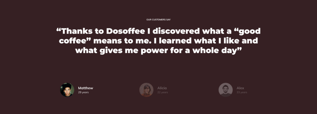
A good option is to include information about the number of current users or companies that trusted your services. Social proof is something valuable as people believe that something is good by looking at the number of people that use it. In other words, testimonials on your landing page can be very persuasive and work on people who are undecided. The same with the logo of brands that you collaborated with. A good validation is also to display the number of followers from Facebook, Twitter or other platforms. Any statistics that would portray your product as a reliable one will serve your conversion.
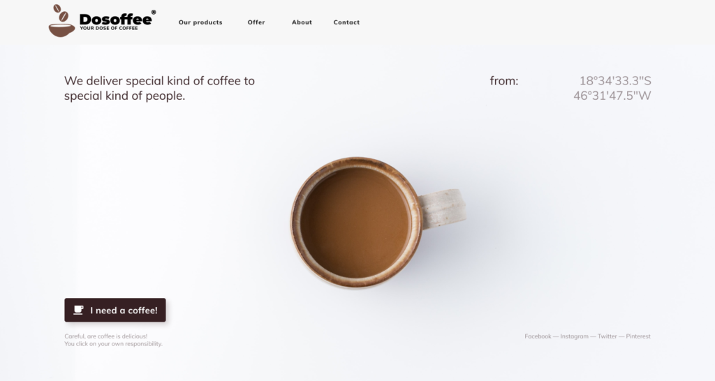
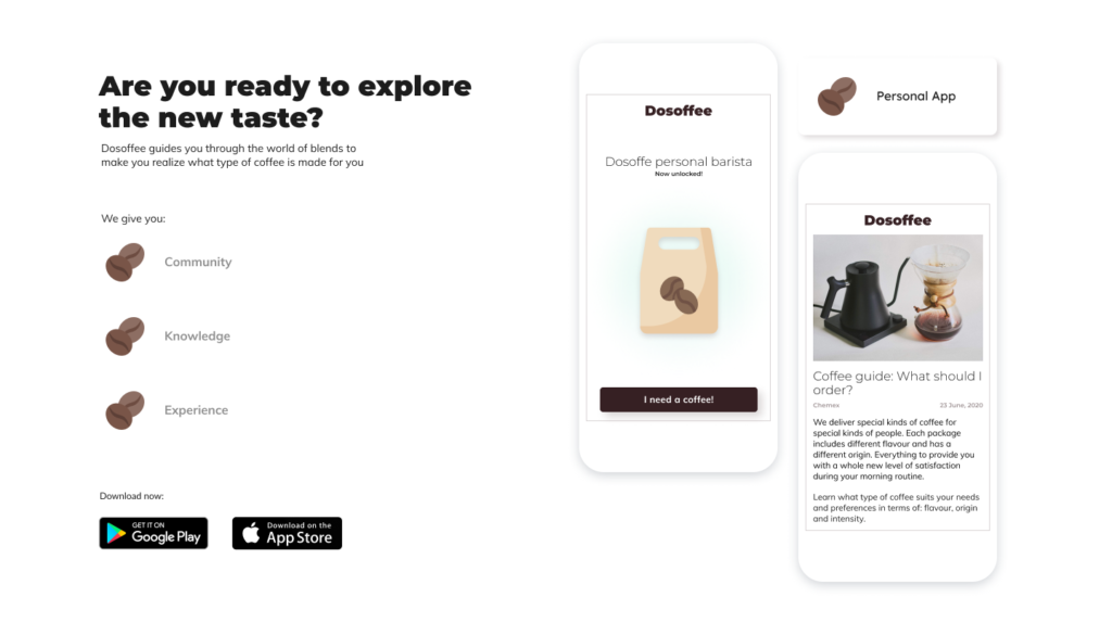
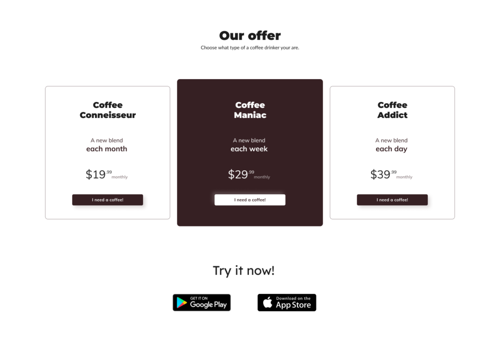
Below we present an example of a well-designed landing page that is made to sell a coffee machine with a subscription program for coffee packages. By the way, read Subscription vs purchase business model – to know which model better suits your product.
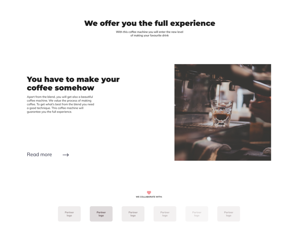
The landing page is consistent in style and color. The front section includes the call to action button – I need a coffee. The CTA button is also placed below in the payment options section. As you can see there is an image of the product itself as we captured some screenshots of our coffee app. We also added social proof in the form of “partner” panel and customers’ reviews. There is a read more that directs a customer to a site with more information about the coffee machine. We provided three subscription options to make the choice more convenient.
Very often the conversion rate depends on a small change introduced to your design. A proof to that can be the Button Color A/B test performed to see if the color of the CTA button decides about the conversion rate. It turned out that when making two exactly the same landing pages (except one with a green button and one with a red one), the red button outperformed the green one by 21%. To be able to run such A/B tests and see which configuration works best you should use a proper analytic tool that would measure the conversion of your landing page and inform you about the progress.
To monitor parameters like time spent on your page and the total actions taken you can use Google Analytics, Hotjar or Yandex. A good tool is also Crazyegg which will help you understand why customers leave your landing page and Pingdom which serves as a speed test to show you how long does it take for your website to load.
that converts is not always easy as many factors have to be tested out before deciding which one generates the best results. Also, the marketing trends change and you have to keep up with them to know what can be done better in your project. Remember that each change brings you closer to the conversion goal as long as you pay attention to the analytics.
We all know that poor design negatively affects user experience and sales results. We also know that different devices don’t share the same capabilities and have their own limitations. Each of the limitations influences the app creation process and has to be taken care of respectively. That’s why, designing a smartwatch app, a designer has a slightly different approach than he has while working on a mobile version.
It is said that you can replicate about 60% of app functionality on a smartphone and then 20% on a smartwatch. It’s because mobile phones allow for more interactions than a smartwatch. Smartphones have bigger screens, displaying everything clearly and provide a lot more functions to a user (i.e. watching movies). Also, they are better adapted to phone calls. As a wearable device, a smartwatch is of course smaller. It was invented mainly as a gadget that would be more comfortable and less disturbing than the phone. And even though today, you can make phone calls and send messages on a smartwatch, the app responsible for that had to be designed specifically for that device to be able to provide users with satisfaction.
Designing an app for a smartphone we already have to limit ourselves, however, today the mobile phones reach the size screen of over 6 inches. It is quite a lot of space to accommodate the functionalities in a convenient and intuitive way. The biggest screen size of a smartwatch is 2.4 inches – Neptune Pine. When we take a standard Apple Watch Series 5 we have an only 1.78-inch display. Since the screen is smaller the buttons in an app should be more visible but then you can’t have too many of them as they will cover up the whole screen. That’s why the app functionalities are limited to only a few that are most needed. It is made also as to not complicate the app. Its nature should be quick, useful and informative.
Different interactions of a smartwatch app should be alerted in different ways. Physical vibrations are for one type of interaction and screen glow for another. This way a user can easily define the importance of information. Also, users have to be able to read whatever pops up on the screen from different angles while moving. That’s why you should ask yourself a couple of simple questions:
Designing a smartwatch app a designer has to think about the convenience of use twice as much as he does while working on a mobile version. This kind of project is very demanding because having relatively small resources, a small amount of energy and usage restrictions, you need to provide the users with high-quality functionalities. At the same time, you need to make them remember that it was this app, they were using. To meet user expectations, we consider all the problems while creating user stories. We write them to predict different behaviors of people using the app. This way we can come to the conclusion that the ability to turn off notifications and buzzing is a valuable feature that must be added.
Smartwatches are not as powerful as mobile phones. Memory storage cannot be filled up, too many wireless connections are also undesirable for the processor. The device can quickly heat up and we don’t want that as it is close to our wrists. The battery is smaller so it discharges quicker. However, there are features that outperform typical smartphones and can be implemented to improve the overall usage:
If an app isn’t designed specifically for a given device, chances are you won’t be using it. It’s not only the matter of an aesthetic interface but the functionality and UX that have to be tailored to a given construction. The decreased surface is challenging but today’s smartwatches show it is possible to modify the functions so they suit the device and provide excellent life assistance.
Ten years ago, the idea of design thinking wasn’t very popular. The first mobile apps were created based on the gut and ideas of their founders. However, the development and growing market of mobile and web applications showed that the UX and deep understanding of the users play a huge role in the success or the failure of the app. Here’s why we should take care of UX before any line of code is being written.
That’s exactly what defines the concept of UX and it underlines the importance of the users being in the center of interest. It’s what they want and what will favor their usage that has the biggest matter here. Customers want to be provided with a simple yet nice-looking interface. They expect an app to be easy to use but capable of performing multiple functions at once. The role of UX designer is to visualize how a user navigates through the app. He optimizes the user comfort suggesting changes to the screen layout and graphics.
UX design is not about creating for the purpose of aesthetic. All is made for the purpose of user satisfaction with the functionality of the app. In fact, poor user experience appears to be one of the main factors why people stop using or delete the app from their mobiles. According to a report from 2018, 21% of users abandon an app after one use and it is still less than it was in 2017 (24%). It happens when an app doesn’t deliver the desired experience and it can be a fault of poor flow or bugs. Anyway, there are factors that operate on the users’ journey through the app and we put some light on them.
What must be clear to the eye is the visual flow of the product. It should guide the users from the first screen to the last one. Consider the flow of an app and interactions. Ask yourself – If I were a user, how would I navigate through this interface? Do I know what will happen If I click on this or that? If not really, then you know you need to improve the UX of your app. Also, the buttons that are intended for different mobile gestures (clicking, double-tap or swiping), have to be made in a way that suggests a user, the next thing that will happen. When things are made in an intuitive way, users are not confused.
Then there is a concept of UI (user interface). The UI covers the design part. The chosen shades, typography, and graphic elements that should coherently present the product. A good UI can be the element of UX and serve as a hint of what should be done next. Because the way an app looks correlates with the satisfaction from the usage.
Bear in mind that user behavior is different on mobiles. The smaller screens somehow dictate the usage and the flow of an app. Here is why you need to take care of the right button layout. Make sure there is enough space between elements to avoid troubles aiming at one of them. The next thing is to reduce the time spent searching the needed options. When users get lost in the layout, they already know the app doesn’t meet their expectations or is too difficult to be used. Eventually, they may just switch to another one. To help them quickly find what they need, think about a good menu, proper flow inside an app and other solutions a user may be familiar with. Mechanisms like autocomplete and prediction text assistance will also greatly improve the UX of your app.
You should aim to minimize user involvement in the process of registration. Reduce the number of one’s inputs needed to create an account. In the beginning, ask for the necessary information only. Credit cards and registration details can be added later. This way the search effort decreases what can have a positive influence on conversion rates. Also, add multiple registration options (login via Google, Facebook, LinkedIn) as people like when things are done quicker.
Don’t flood users with long lists of criteria and regulations they need to accept before using the app. Include only the most important and essential permissions. Don’t ask for access to the photo gallery or camera if it’s not necessary. It has to be explicitly stated why do you need such information as user trust is something most valuable today. In addition, users should be able to decide how their personal data are shared. To give them insight into your politics, attach a link that leads directly to the privacy regulations page.
The onboarding process is a good idea as it shows users how the app works and it guides them during their first time. The animations are much better than text as they look appealing and communicate core features more effective. If your app relies on user-generated content then you should definitely implement onboarding as one of your strategies (as Tumblr does). What’s more, people should have space where they can ask questions, having problems with usage. Add live chats, helpline or FAQs form to provide them with different support options available at any time.
Always check what is happening inside of your product. If the introduced features have more user acceptance than the last version then you can be happy but it’s never really over. Testing the product is crucial to have a clear picture of what makes people engaged in your product and which part is rejected. And it’s changing just like trends on the market. But you need to know how to improve the UX of your app as this is how you create an update. To know more on this subject read: When to update an app & how to prepare an update.
To end up with an excellent UX & UI is an ongoing process. Not every trend will work on your product. You have to research and customize features that suit your target group and your app as well. Smaller screens can favor your creativity but also create some obstacles on the way. Remember that only when the graphical layout harmonizes with the general purpose of the app, there is a chance to get more users interested. Lastly, test what you already have and modify functions observing user feedback.
Creating a product you need expertise from many different fields. You won’t build an app without a plan and you won’t write code if you don’t know what should be the outcome.
Those two disciplines cross with each other when it comes to working on a project. It’s when designers and programmers should combine forces to deliver the best results possible. Why is it so much easier when those two groups collaborate? The answer waits below.
A programmer codes. A graphic designer (as the name suggests) designs, even though in scrum designer is one of the “developers”. What’s an important detail here? Both create the product. We can all agree that the consistency of an interface of any product is important. The easiest way to achieve it is to make a project team consisting of those who take care of its visual aspects but also those who build the code of it. When the two groups communicate with each other while working and respect their fields you can expect satisfying results.
Imagine being a programmer and receiving a finished project from a foreign studio. Someone would say that your only job now is to program the app as they want. But is it the only one? If the software house doesn’t collaborate with the studio and it’s not time&material contact, it means that you cannot ask or suggest a better solution that would not only be easier to make but also which would be more innovative.
Let’s start by saying that it’s not done through the scrum method. To prepare a visual project you need to be given a brief, so the assumptions on which bases designers make an interface. Without it, there is no way to introduce changes when the file goes from programmers to designers.
Lack of communication most often leads to a situation when a developer designs the interface but does it too quickly. Under the pressure of time, he mirrors the elements that are already there. It can also end up with the founder taking responsibility for how the project should look like. In most cases, he dictates the visual aspects and unfortunately does it wrong.
It can be one screen of your app made for the representation of the future interface. It’s not functional but its purpose is to show the aesthetics and vision in which the project should aim. That’s why it’s good when the key visual is suggested at the beginning. In general, it means that the product will be evolving during work.
What is more, there is a lack of a holistic view of the project. Because of everyone doing their job, there is no one coming from the neutral ground. It may be somebody who knows all of the areas which project requires to succeed. Such a person would look at the whole concept perhaps noticing the flaws of it.
The method described above is based on forwarding a project between a studio and a software house in huge chunks, usually as one big chunk. It is said to be the wrong methodology of work since the drawbacks you already was reading about. Now it’s time to get closer to the right strategy which is called the Agile method.
Work on the project is divided into one week or two weeks periods called sprints. At the end of each sprint, the founder evaluates progress thanks to the internal release of a version and works on the backlog (features which are meant to be added to the product at some stage) with the product owner. This way it is easier to adapt the product to the changing market requirements or concepts. And because of the fact that the work is planned for two weeks ahead (instead of 3 months), when something goes wrong the team loses at most a few days, not a few months. That difference is often crucial if you want to avoid the losses and deliver a product which meets the needs of the market. If you want to learn more about updates: When to update an app and how to prepare an update?
Introducing the Agile method into your work you’ll notice that regular meetings bring more benefits to the table. Developers, as well as designers, participate more in the process of creating the product. They can share their knowledge of the market or of a given sector. They can also resolve minor issues on the go. Also, they can talk with a founder about their experience from previous projects which is often valuable. Some more experienced specialists can even help a company to omit invisible issues which can influence the product’s ROI in the future. The flow of information is greater which favors cooperation and increases the understanding between employees. Not to mention the fact that working this way, creating the first version of a product does not differ from continuing its further development. A designer doesn’t experience a 4+ months gap during the project but he is deeply and constantly engaged in the process. Same thing around programmers who are strongly involved which translates into greater effectiveness.
Having a team of specialists from different fields, you meet with many perspectives and opinions about the product. From one side you hear about user experience and user interface, from the other about the technical part of it. And your job as a founder is to take as many meaningful suggestions from both sides and combine them so that the product work and generate money. When programmers and designers communicate with each other and create the product together from the very beginning, the chances that it will succeed and provide final users with value are much higher.
You don’t have to attend separate meetings or making daily phone calls to be updated about the progress. You have all the important people in one building so when having second thoughts about the project you make a meeting to discuss it. However, they don’t have to be in one place to be a part of your project team. Graphic designers who work remotely and effectively communicate with developers are still good contributors who matters. Coming back to the ‘foreign studio situation’, when such studio communicates with software house while building something from scratch, it does make sense. It’s all about keeping everyone on the same page and making sure that both groups exchange information when making any changes.
Rember that the goal is always to create the best possible outcome. Working together isn’t always easy but the relationship between people strongly affects the thing their work on. It takes a lot sometimes to let go of our strongly held opinions and just listen to what the other side has to say. But to learn a compromise and respect is something most valuable in this job. It helps to deliver all the projects you can be proud of later.